A timely release...
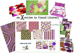
If you've taken my TrendWatcher class or are used to my ramblings, you know I'm all about increasing everyone's visual literacy. Simply put, that means opening your eyes to recognize emerging trends and color combinations already occurring all around you to give you a better understanding of design. Trends in interior design are always echoed in paper arts and I pulled together a few visuals to illustrate what visual literacy is about.
Ginger, the designer of Gin-X, is my friend and one of the more naturally visually literate I've met. I saw her sneak peeks of her new lines and was inspired to make a visual literacy reference for each so you can see them the way I do...Ginger these are a HOME RUN!!! you go girl...
Ginger, the designer of Gin-X, is my friend and one of the more naturally visually literate I've met. I saw her sneak peeks of her new lines and was inspired to make a visual literacy reference for each so you can see them the way I do...Ginger these are a HOME RUN!!! you go girl...


4 Comments:
Love the purple in this one! There's not enough purple in paper!!!
I like this one too!
- Carolyn (again)
LOVE THE PURPLE!! Purple has always been my fave color - when I was six, I had my room painted lavender.
And Emily - I love how you see the colors in various products and bring them together to show just how timely the scrapbooking industry (and particularly Ginger of course) is re: colors. Very cool!
I'm not a trend watcher, and even tho I've known that especially in the past few years, scrapping is either right on time or even on the leading edge when it comes to color trends, it's really neat to see it literally pointed out.
Finally more purple! Looks great. Gin-X is always so cutting edge!
Post a Comment
<< Home